Indorse – Rebranding
Often, subjective factors such as looks and gender affect hiring decisions.
Indorse is the first professional network where only skills matter.
The Singapore-based company has found a way to validate skills in a way that benefits both employer and candidate: simple and highly objective.
Aiming to tackle inequality in the global economy, the Indorse brand empowers its users by embracing unique skills. Designed in collaboration between the Moby Digg Studio and Serviceplan Innovation Team.

Teaser Trailer
Design System

Shaping
a new work era.
Our identity system is made up of three basic shapes. The square symbolizes the blockchain technology behind our platform. The ascending triangle represents skills and their learning slopes. The circle represents the community that validates each skill.

Illustrating
skill diversity.
Our color scheme reflects the uniqueness of each skillset. Every skill is represented by a distinct color, and all colors can be combined with each other. This allows users to receive personalized palettes that embody their skillsets.

Encouraging
personal growth.
Our shapes adapt to users as they continue to learn new skills and achieve new goals. Shapes grow larger as users reach new levels, and their straight edges transform into curves when skills are validated.

Unleashing
infinite potential.
The empty lines in our system stand for skills that have yet to be acquired. These lines of encouragement help remind users that they have what it takes to master any skill and motivate them to try something new.
That results in,

Mapping
out individuality.
Our patterns serve as abstract representations of the skills each user has. Using the generative tool, they can access individual patterns that reflect the skills they have. As users add more skills and validate them, their patterns transform.
Connecting
through clarity.
Our custom icons stay consistent with the rest of our identity system. Their geometric shapes make them easy to understand, which allows us to communicate with users in the most quick, concise manner.

Symbolizing
skill.
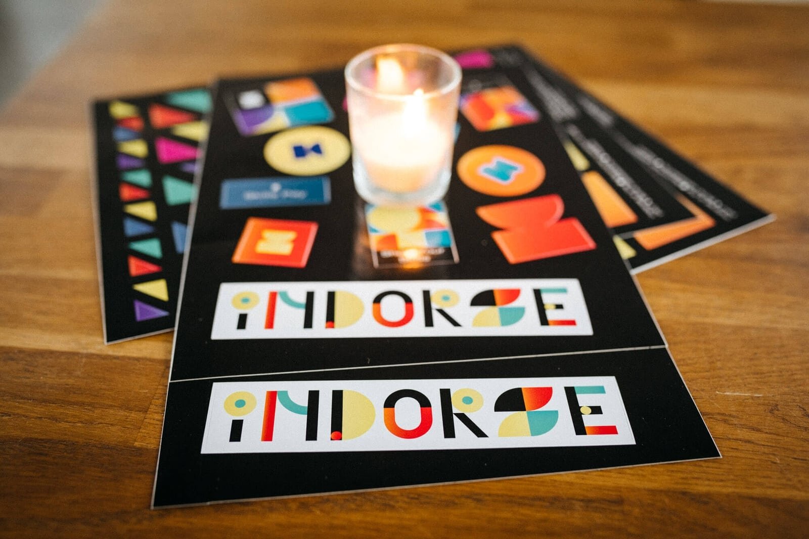
Our logo embodies the different factors needed on the journey towards success. It's shaped liked a trophy to show the importance of skill validation. It also makes up the Indorse “I” and shows the balance that is essential to the skill mastery process.

Rewriting
the rules.
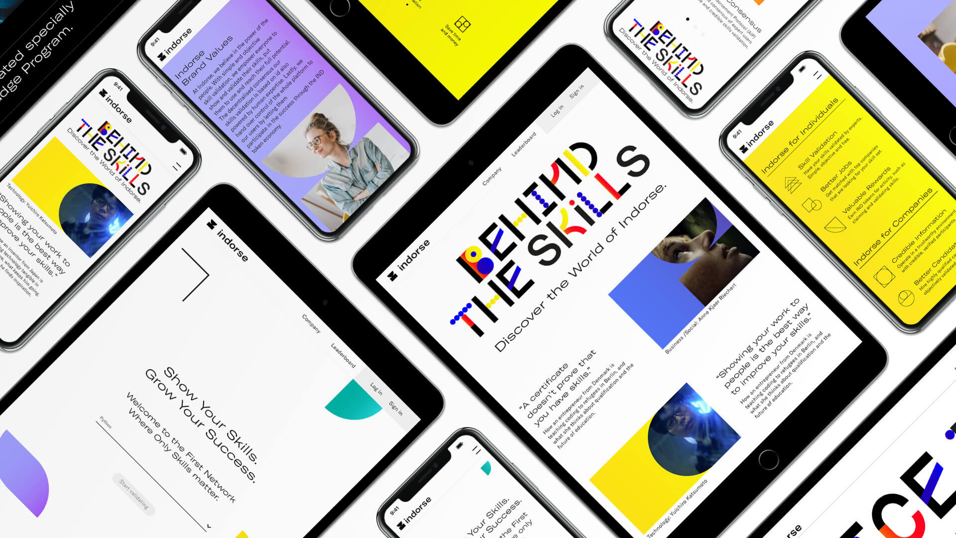
Our specially tailored typography brings the playful Indorse essence to each one of our messages. It breaks free from the norm and encourages our users to think out of the box and try something new.
The Indorse Brand
Bringing skills to life.


Generative Tool
Try it out: generative.indorse.design.

Custom Font
Designed by Moby Digg. Download here.

Launch Event


Video Portraits
In collaboration FvF Productions, we created three engaging video portraits with three drastically different, yet equally fascinating personalities: Congolese-French Chef Mick Élysée, ReDI school founder Anne Kjær Riechert, and Japanese gadget maker Yuichiro Katsumoto. Focusing on the how the individual protagonists have gone above and beyond to reach the top of their respective professions, each video combined classic, human storytelling with thoughts on the future of technology and communication.


Behind The Scenes


Collaborators
Indorse, Serviceplan Group, Moby Digg Studio, FvF Productions and more.